Virtual Business Coaching
Logo Case Study
Introduction
I am pleased to present to you the logo created for Virtual Business Coaching, an innovative startup that offers online business coaching services. Counseling and training are delivered through virtual sessions, allowing companies to enhance their skills in a flexible and efficient manner.
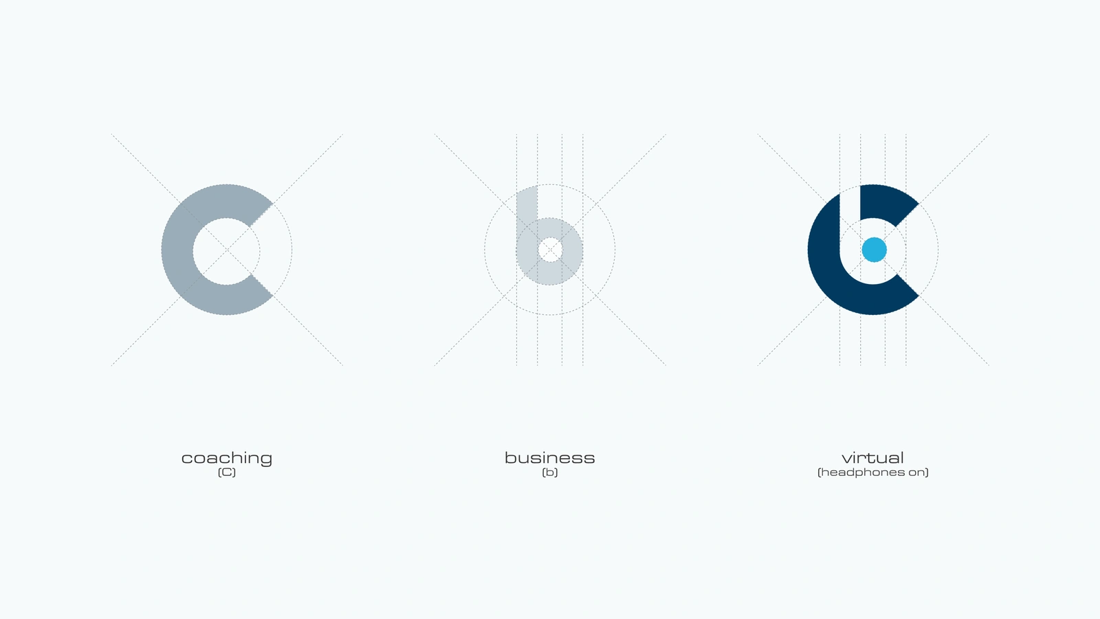
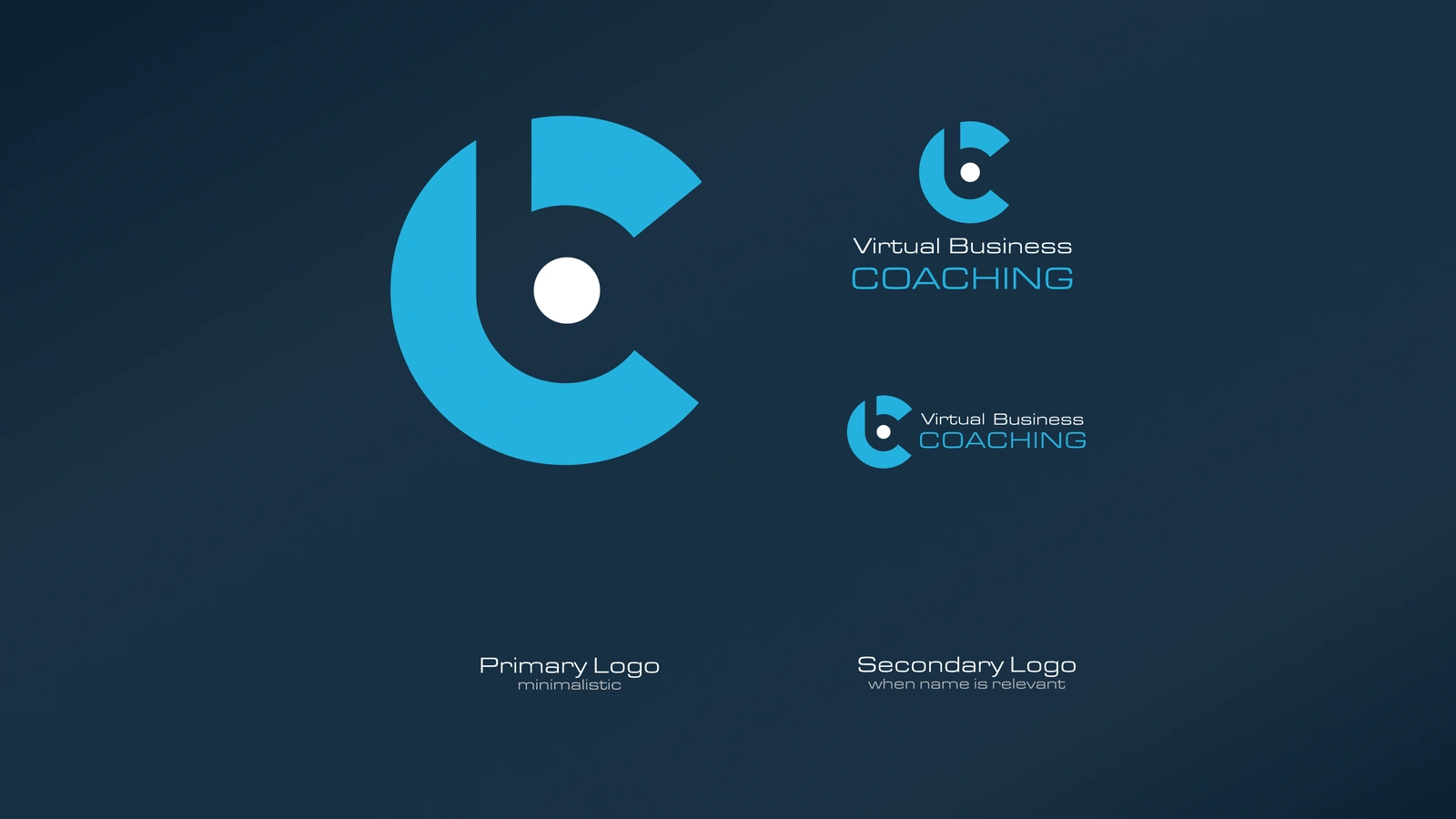
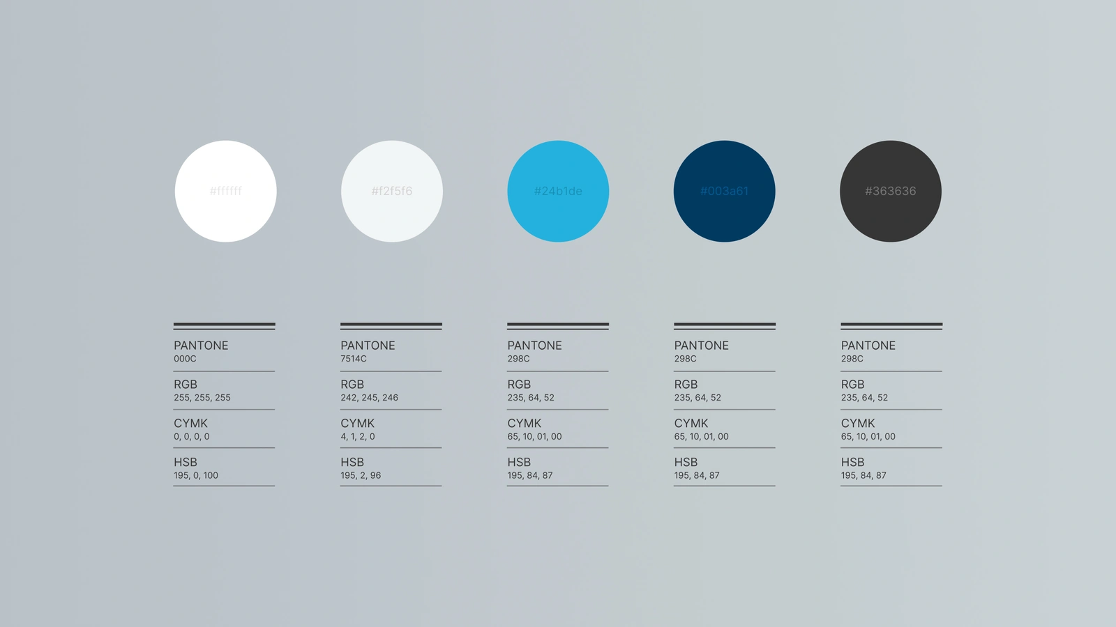
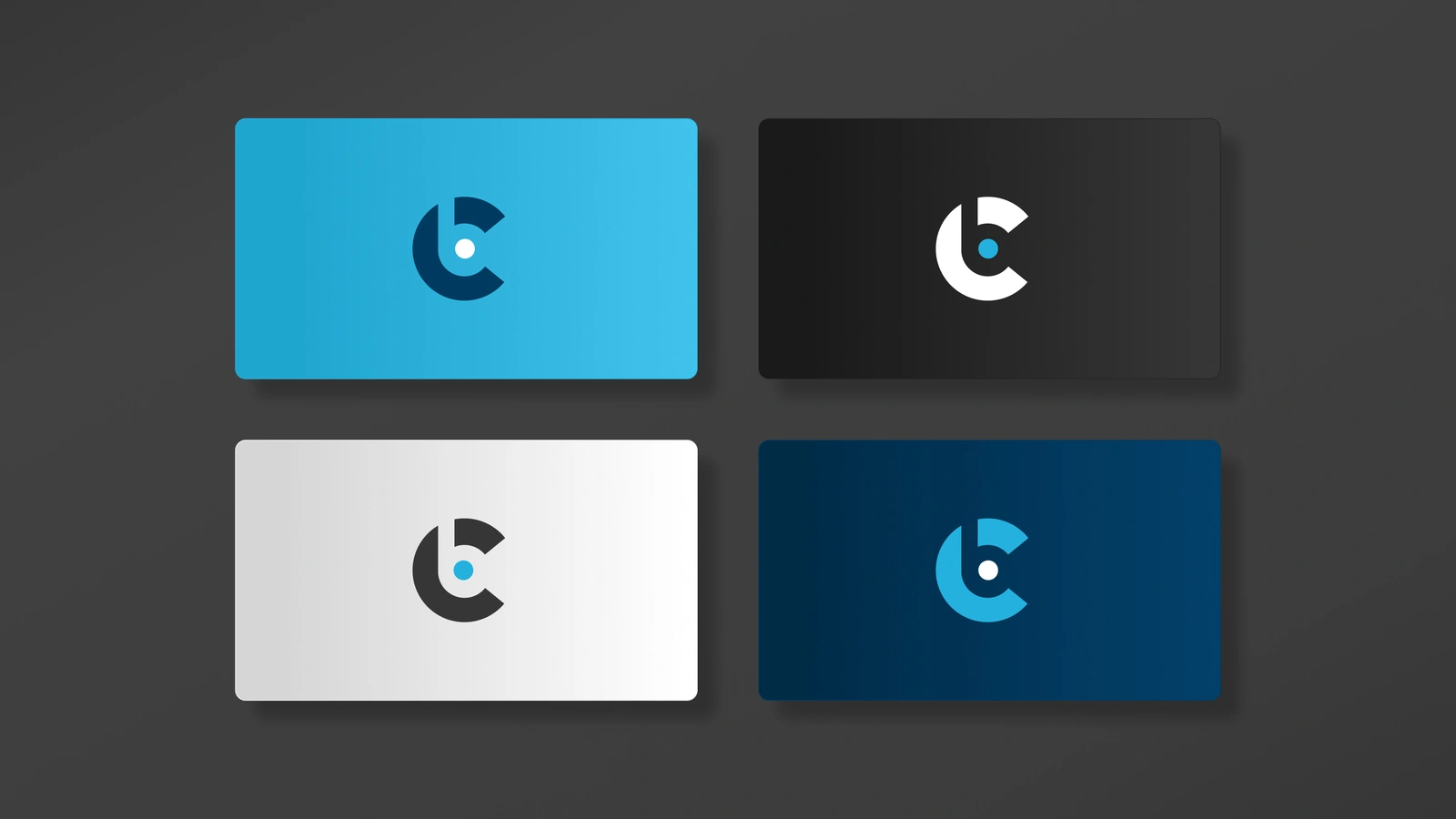
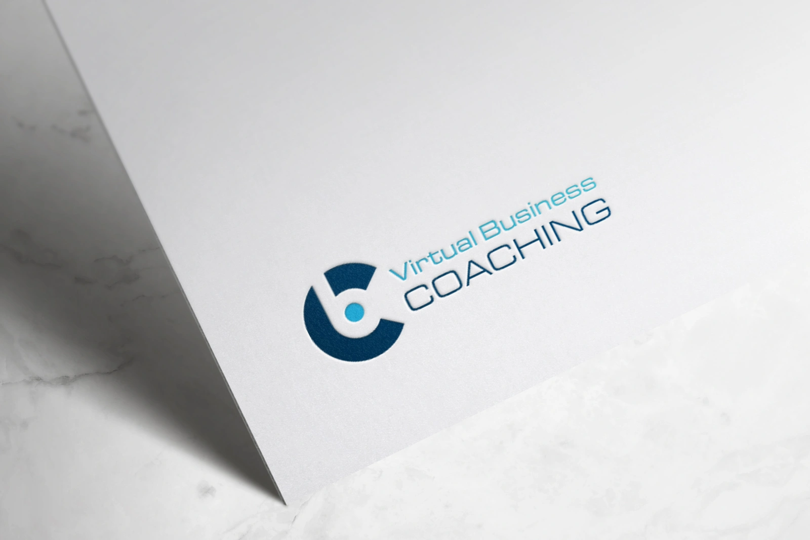
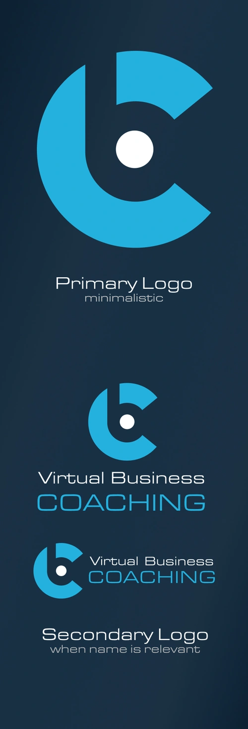
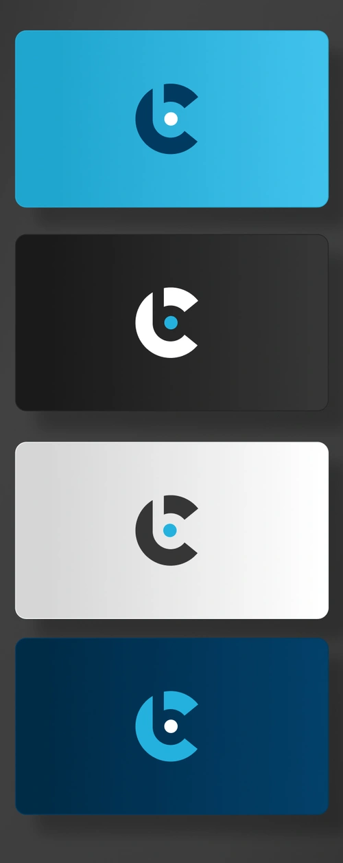
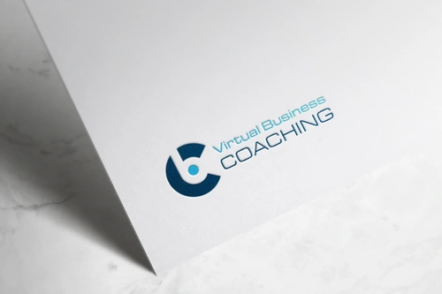
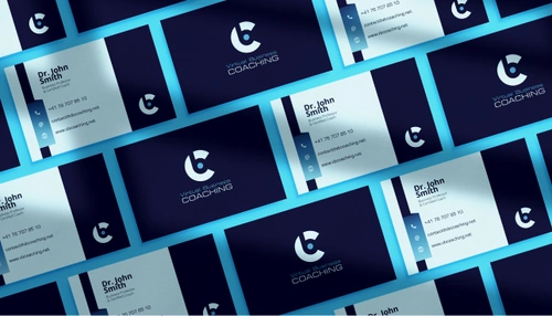
The logo design has been carefully crafted to reflect the values and identity of Virtual Business Coaching. It skillfully combines the letters “C” for coaching and “B” for business with the shape of a headset, symbolizing the virtual approach of their sessions. The rounded shape of the logo gives it a youthful and dynamic look, while the choice of colors – blue, sky blue, and white – evokes the authority and professionalism typical of the business world.
To ensure that the client can choose the logo version that best represents their vision, several variants have been created. This allows the client to select the one that they feel is closest to their corporate identity.
Overview
The presentation will be structured as a sequence of slides that detail the case study and the logo development process for Virtual Business Coaching. Each slide will provide a clear and detailed overview of the path taken, from the initial stages of analysis and research to the design iterations and final color choices.
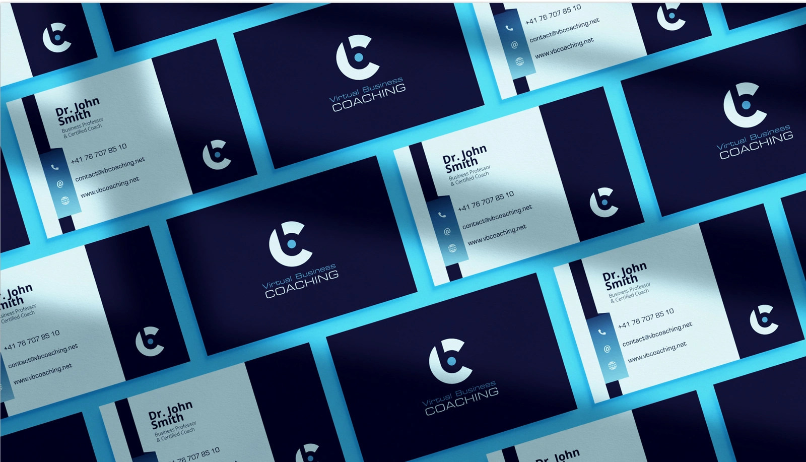
The presentation will embody the concept of virtual coaching and the balance between youthfulness and authority in the logo’s aesthetics. Various prototypes and preliminary versions of the logo will also be showcased, highlighting the design evolution and decisions made along the way.
The presentation will not only offer an opportunity to share the work done but also to provide an engaging and compelling narrative behind the creation of the Virtual Business Coaching logo.
